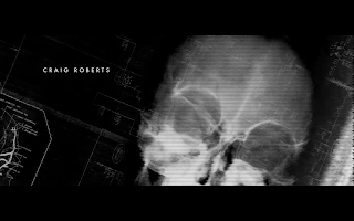
Title & Credit research (Red Lights) by Kaz
- all capitals
- simple typeface
- quite small font size in contrast to the background size but sometimes font shown bigger creating similar to the flickering of street lights
- when the title appears, the red lights flicker behind the title to enhance the title and gives the meaning of the title
- everything is black and white except the red lights; as the red lights are enhancing the title so they're in colour
- fragment of the lights in the background make us imagined of the lights
- use of negative space - allows us to see the images as well
- the texts appears parallel to the non diegetic music
- when drums playing, the texts flicker and changes position slightly
- most positions of the texts are parallel or vertical to the image
- each image and text is well organised, seems to be arranged by designer, so they're eye-catching and draws attention


No comments:
Post a Comment