- White against a black background - was made at a time when black and white films were mainstream, but also creates a stark, bold effect.
- Font is in bold and block capitals are used throughout
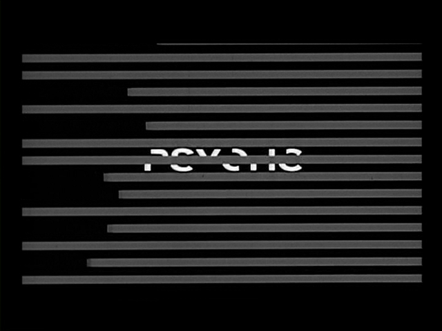
Transitions:
- Grey lines are used to bring in and take out the text, creating a swift transition, which creates pace.

Film's Title
- The text is segmented and then moves to create the full title.
- This reinforces the distorted effect used througout the title sequence, and suggests that piecing parts together is a key theme in the film, which suggests the film is on the topic of murder.
No comments:
Post a Comment