1. In what ways does your media product use, develop or challenge forms and conventions of real media products?
- enigma
- suspense
- protagonist
- antagonist
- real life
- raising questions
This is a pan up shot of a main character's feet. The first shot of the whole sequence creates enigma by immediately raising various questions. (whose feet are they?, what's this about?, why somebody's lying on the ground?, where is this?) This shot already gives the audience information of the character, who is a girl. Because she wears typical teen girl's cloth such as pumps and leggings for her costume, the audience would know she is teenager. The setting in this shot is the girl lying in the woods. This is typical scene in a thriller film, uses irrelevance between the character and the background to create suspense and atmosphere to start the opening of a thriller film.
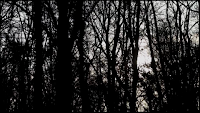
This is an establishing shot of the woods provides to discover the situation between the character and the setting. This setting in the woods is also typical in a thriller film as establishing the surrounding of the main character tells the audience that something will happen to the character, and that create eerie atmosphere. Only the natural sunlight was used in this shot but we created silhouette effects so the woods look more mysterious and grotesque.
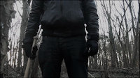 This is a pan up shot of a guy trying to swing his baseball bat. We used a baseball bat for props in this scene. This is also often used in a thriller film. The guy wears all black, which is because black makes the character an impression of unknown, dark and scare so that fits into the murder character and also the leather gloves and the jacket makes the situation more serious. The lighting in this shot is quite dark and dim with a little of silhouette effects which leaves the guy looks more terrifying. Also with the low angle shot creates the guy more dominated and powerful.
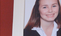 This is a close up shot of the girl's portrait photograph. The audience would immediately imagine wether she is dead or not from this shot. This technique is often used in a thriller film. Arranging the whole story in non-chronological order to create more suspense and enigma. Because the setting is changed to the house scene, the audience would think about the girl. In this shot, the setting is completely changed as we can see the background colour is warm red and the camera is also fixed, which convey the difference between the setting in the woods and this scene. The fixed camera tells emotion of calm and relaxed, no hurry and rushes in this shot. The use of portrait photography is also typically used in a thriller film.
This is a shot showing props. These props are to show that somebody is relaxing and rich. The tea and the biscuits are symbol of slow down and unwind, creating the contrast to the woods scene. The magazine is also to create the mood of the relaxing, as people often read the magazine when they have nothing to do. The shot includes two people's legs behind the table to raise questions to the audience. (who are they?) The lighting in this shot is quite bright in contrast to the woods scene, to enhance that it is peaceful in this shot.
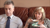 This is an eye level 2 shot of a guy and a woman. This shot finally introduce two people who look like the parents of the girl. They are calmly watching TV, although the girl isn't there. This eye level shows that they are same position as the audience. The lighting is very bright as well as morning or noon which create peaceful mood into the scene. Diegetic sound is used to realize normal life as near as the audience's to create more enigma. Real life setting is typically used in a thriller films.
This is a low angle shot of the guy opening the door. Since the door bell rings, the guy suddenly looks worried, from which he is dominated and kind of scared, so this low angle enhance his emotion more to the unsatisfactory way. The lighting tone in this shot is also changed slightly darker than the living room scene, to create tension. The sound volume is also turned down slightly, the diegetic sound is playing off-screen, because he walked out the living room so it's very quiet in front the door. Only the door opening and footsteps are able to hear in this shot, which increase tension.
This is an establishing shot of the woods provides to discover the situation between the character and the setting. This setting in the woods is also typical in a thriller film as establishing the surrounding of the main character tells the audience that something will happen to the character, and that create eerie atmosphere. Only the natural sunlight was used in this shot but we created silhouette effects so the woods look more mysterious and grotesque.
This is an extreme close up shot of the main character. The use of ECUs is conventional in a thriller. The main character is looking down so she looks ill or sad, leaves the audience with more questions of what's happened. The audience would imagine that she is not feeling well and that would make the film to have a good start as a thriller film. We filmed this shot with hand-held, as it is not steady which create uneasy emotion to the main character.
 |
| Extreme Close Up shot from Hereafter |
 This is a pan up shot of a guy trying to swing his baseball bat. We used a baseball bat for props in this scene. This is also often used in a thriller film. The guy wears all black, which is because black makes the character an impression of unknown, dark and scare so that fits into the murder character and also the leather gloves and the jacket makes the situation more serious. The lighting in this shot is quite dark and dim with a little of silhouette effects which leaves the guy looks more terrifying. Also with the low angle shot creates the guy more dominated and powerful.
 |
| Low angle shot from Inception |
This shot shows the title of our film. The composition of this is organised well because the white font is easily seen with dark background and with simple font. Although there is some white space on the half top, the title still stands out. The running woods in the background might disturb the title but our use of dark space in the half bottom made it not difficult to read. Also the dull font is in contrast within this background. The title appears when non-diegetic sound plays. The non-diegetic sound is parallel to the scene, make them more mysterious and create eerie atmosphere and mood.
 This is a close up shot of the girl's portrait photograph. The audience would immediately imagine wether she is dead or not from this shot. This technique is often used in a thriller film. Arranging the whole story in non-chronological order to create more suspense and enigma. Because the setting is changed to the house scene, the audience would think about the girl. In this shot, the setting is completely changed as we can see the background colour is warm red and the camera is also fixed, which convey the difference between the setting in the woods and this scene. The fixed camera tells emotion of calm and relaxed, no hurry and rushes in this shot. The use of portrait photography is also typically used in a thriller film.
  This is an eye level 2 shot of a guy and a woman. This shot finally introduce two people who look like the parents of the girl. They are calmly watching TV, although the girl isn't there. This eye level shows that they are same position as the audience. The lighting is very bright as well as morning or noon which create peaceful mood into the scene. Diegetic sound is used to realize normal life as near as the audience's to create more enigma. Real life setting is typically used in a thriller films.
This is a low angle shot of the guy opening the door. Since the door bell rings, the guy suddenly looks worried, from which he is dominated and kind of scared, so this low angle enhance his emotion more to the unsatisfactory way. The lighting tone in this shot is also changed slightly darker than the living room scene, to create tension. The sound volume is also turned down slightly, the diegetic sound is playing off-screen, because he walked out the living room so it's very quiet in front the door. Only the door opening and footsteps are able to hear in this shot, which increase tension.
 |
| Low angle shot from Inception |
2. How does your media product represent particular social groups?
Social group (gender, age, social class, ethnicity, and sexual orientation)
There are three characters involved in our opening film, two females and one male. They all represent different social groups such as gender, age, and sexuality.
The guy (protagonist) - male, middle age
The girl (antagonist) - female, young teenager
AGE
The guy is represented as a middle aged male. He has positive connotation for him as threatening and sinister. The girl is represented as a young teenager. She also has positive connotation for her as weak and pathetic.
GENDER
Both representations of gender in our characters, shows in stereotypical ways. The girl is represented as a femininity, weak and obedient, through her body language, as she is lying in the woods. Her costume also reflects to the stereotypical young teenager; leggings and pumps. The guy is represented as muscularity, strong, dominant, aggressive and in charge. As we can see his black costume suggests him as tough and villain. The dark colour symbolise darkness and hidden.
 SOCIAL CLASS
We used flowers, statues, candles, a tea cup with some biscuits, table, and lamp for our Mise en scene to represent a middle class family in our film. Diegetic sound is used in this scene to show that they've wealthy lifestyle. We used Antique Roadshow in the background sound as it's TV programme which is likely to be watched by older middle class audience.
3. What kind of media institution might distribute your media product and why?
The most obvious media institution that would distribute our product would be YouTube. YouTube is easy and quick way of distributing media product for free. Anyone can access YouTube without an account, and therefore, independent filmmakers heavily rely on YouTube to post and distribute their short films. For this reason, audiences can view the short films for free, leave the feedback and even share these films with their friends through social media. This would achieve word of mouth effect and hence bring more people to watch the film.
It is beneficial to distribute our film through cinema and online streaming simultaneously. We would release our film on Friday as people are more likely to go to cinema on Fridays. Because contemporary films are mostly being watched online, we could distribute our film through video streaming website such as Netflix, iTunes and LOVEFiLM. Distributing our film online would not cost as much as releasing it into cinema or DVD, this would save our budget on marketing as well.
As our budget is very low, entering our film into local film festival or national film festival could make it noticed by people, and would cause independent film companies interests in making our film into a feature film.
Because our target audience is more likely to use Internet, it is beneficial to use posters, trailers or website ads to promote and advertise our film. The social media, such as twitter and Facebook, would be the most effective way of promoting out film, therefore we could put poster or trailers on there.
4. Who would be the audience for your media product?
GENDER
Even though our product focused on a young female character in the beginning, the main character is male. This towards a male audience, as they would portray him better than the female character.
 AGE The main character is belongs to middle age and the female character is clearly teenager. As these two character would related to the people who are age between teenage years and adulthood.
 AGE CERTIFICATE After reading each age classification on BBFC website, I would class our film as 15. This is because our film contains violence and strong language. As we can see from our opening sequence, guy hits girl with baseball bat, and which is violence. And the main character, seems likely to be a gangster. Gangster typically and frequently use F words, which belongs to strong language.
- Pulp Fiction (1994)
- Se7en (1995)
Because these two films are same age certificate as our thriller film's, our audience would like these as well. Also, our audience would like both of these real films because According to IMDb, both two films are ranked in the top 10 of feature thriller film with more than 1,000 votes. Pulp Fiction ranks the best one, and Se7en is No.6.
5. How did you attract / address your audience?
Character
- Casting a young girl would create sympathy and attract young men demographic
- Introducing unknown victim silhouette in the opening scene to draw attention and create intensity
Narrative
- To retain attention from our audience throughout the film, we used the non-chronological order to reveal the story gradually
- By slowing down the pace of each cut keeps our audience wanting to watch further
- Questions are raised to the audience by using a majority of POVs to attract audiences' interests in finding out the answers
Sound
6. What have you learnt about technologies from the process of constructing this product?
7. Looking back at your preliminary task, what do you feel you have learned in the progression from it to the full product?
Through all the works, I feel I have progressed hugely in my skills, especially with editing and sound (foley). This is because editing was my responsibility in both prelim task and main task. I have improved using Final Cut Pro and Garageband enormously. I was not able to use any filters in Final Cut Pro before, but I can now use/change things such as motion, colour correction and cropping easily. For Garageband, I could only add sounds when I started using it but could not change the volume, now I can adjust the volume easily. I am now more skilful in using these software to construct narratives.


